Showing posts with label typography. Show all posts

Friday, January 25, 2013

Undead Illustration #3: (Almost) The Cover Of New York Magazine

A little over a week ago I received a late email from New York Magazine asking if I had time to kick around sketches for a possible cover. That's a no brainer. The following morning I received the brief: it was a write up about a new mental health study that explores the possible and varying degrees of psychological trauma inflicted upon almost every adolescent American in the name of their basic education. Taking a slightly lighter approach to the art, I'd been asked to create "angsty teenage" typography that said "high school sucks!" and populate the negative space with scribbly doodles of a notebook variety. The designers at NY cobbled together the following comp for me:


As a high school slacker whose mind was often lured away from AP chemistry by his unflattering drawings of faculty members and, somewhat less-straight forward, Batman and Boba Fett in a variety of mundane everyday situations, the prospect of this job actually going through felt slightly incredible, and I had a brief visceral thrill at the possibility of getting paid for the very thing which I was told time and again would dash what little hope I had of any semblance of a career against the merciless rocks of some boho cum Reefer Madness like descent into a hazy drug fueled life of low level misdemeanors and rakism, these distracted doodles but the first tentative step down the proverbial slippery criminal slope perhaps culminating in some sort of anti-art after school special aimed at dissuading impressionable youth from the same treacherous path.*  I grabbed my copy of The MC5's Back In The USA and dug up some old high school notebooks for reference and inspiration...
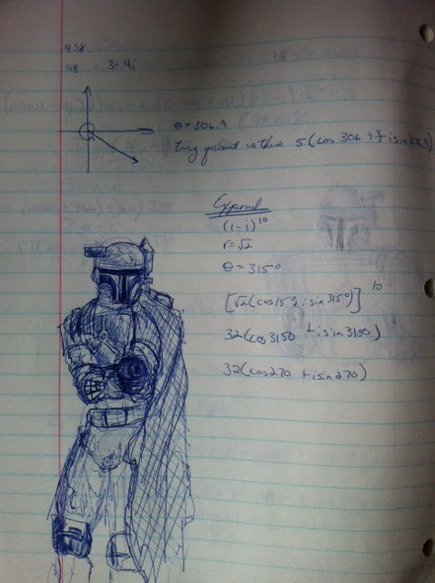


I think those original Star Wars rereleases had just happened, this is probably early 96?


Yeah...

And I think this IS actually my chem teacher, sci-fi horror brain only slighty exaggerated if memory serves...


...and quickly cranked out the following sketches. Because time was short, I was advised to let the designers comp in some "doodly" drawings from my website until they were sure we had approval. I drew several versions of the words as quickly and loosely as possible, then started pairing up the more successful treatments of each.


Ultimately however, the editors chose to walk back the cavalier language of the original art direction and go with a more ambiguous, serious and i believe authentic actual high schooler drawing. C'est la vie. On the other hand  I can totally appreciate the Twombly black hole / physics class scribble-out action happening here:


Thanks to Tom Alberty for thinking of me in the first place as these were a blast to knock together even if they never came to full fruition. And as always thanks for reading! You can never hold back Spring...

*things were probably not that harsh or dramatic, I was just trying to get back to the 17 year old brain, maaaaan.

Friday, May 18, 2012

Two Recent Posters For Union Pool


Happy Friday everyone. Real quick, here's 2 recent posters for i show i just played on May 16th and an upcoming one that some friends are playing on May 30th, both at Union Pool. Super happy with how these turned out. Cheers!


Friday, December 30, 2011

Avant-Brunch / Happy New Year

Here's the flier and menu designs for the inaugural "Avant Brunch" presented by old friends Christopher Weingarten and Seva Granik. The editioned 2 sided prints are swag for the event on Sunday, which i believe is sold out at this point. Werd, and Happy New Year!


Wednesday, December 7, 2011

Holiday Mixerrr / Holiday Party


 Holiday Mixer 2 by ted mcgrath

Once again, somehow, the holiday season is upon us. 2011 has breezed by at an unprecedented pace, the sense of temporal dislocation only heightened by todays weather of 70ยบ and foggy... on December 6. In Brooklyn. Spooky? You bet.


But in lighter news, here's another round up of holiday sonic chestnuts for your seasonal entertainment - some are well-worn favorites, songs long canonized by the gods of pop culture and half-remembered office party slur-alongs, while others materialize warbly and weird like Dickensian ghosts of 45rpm crate diggers past. As with last year's offerings, i think they stand up to the "proper" work of the artists involved, and somehow balance holiday novelty and actual listenability quite well. The amateur edits and fades are back too, but hell, it's still better than that She & Him record. Just sayin. 


ALSO: for those of you so inclined and in the NYC area, the cast and crew of The Pencil Factory Studios will be having our annual shin-dig at The Diamond in Greenpoint this very Friday, from 7PM-? Last year's party was a total blast and it'd be great to see any and all of you if you're around. The Diamond is located at 43 Franklin St. Brooklyn, NY 11222, G to Nassau/L to Bedford. 

Happy Holidays Everyone! And here's to fantastic and Mayan Revenge-God free 2012!

-t.


Thursday, April 14, 2011

"Super Flu": Undead Illustration #2

Last week i was contacted by The New York Times Magazine to do some illustrated type for a piece on fighting the super flu, a strain of the seasonal menace that's adaptable and resistant to conventional antibiotics. Over a few days i came up with 3 treatments, all of which i was pretty excited about and ultimately the client as well. Unfortunately, just as the art was approved the story ended up being cut altogether, so no ultra gross microscope type to ruin your Sunday brunch next week i'm afraid...
That said, it's always super fun to both flex the Ed Ruscha-worshiping part of my brain and work for the Sunday Magazine, as they're pretty much responsible for a large chunk of my career. Werd. Type treatments below, the bottom version is what would've appeared in the magazine. 


Monday, February 14, 2011

LOVE CITY


Happy Valentine's Day folks! Above is the cover of the forthcoming "February is for Loverz" themed zine i hoped to have out this week, but due to an extraordinarily busy few weeks doing some weird/awesome Fashion Week stuff with dear friends at the behest of Pepsi (watch for a forthcoming post), this baby won't "hit the streets" til early next week. I figure as long as i beat the St. Patrick's Day decor in drug and convenience stores i'm ok. Anyway, how about that weather?

Thursday, December 16, 2010

For Fun, A Rock Show Flier...


Sometimes you make some fast dumb stuff like this and it just makes you feel good for reasons you can't quite put to words.

Tuesday, November 30, 2010

Animals of Finance...

Ok, puns are pretty bad but i couldn't bring myself to title this post "Recent Projects I Am Excited About" or something like that, it just sounds so dry and joyless...and anyway, somewhere Miles Southan is smiling. Moving on...

Last month i had the privilege of working for two of my favorite clients, both business magazines with stellar art departments, Plan Sponsor and Bloomberg Business Week. Furthering the feel-good vibe of both projects was the fact that each called for a different aesthetic and problem solving approach. 

For Plan Sponsor, i was asked to illustrate the concept of "sharing stories" for a piece about integrating blogging into your business plan. I turned in 2 sketches, the first with an Aesop's Fables direction, the second reviving the tiger-pelt clad weirdo from the abandoned "running shoe of the future" illustration from this past summer:

The client liked the first sketch (sorry again shoe-dude!), and it provided an opportunity to dig into some paint for the first time in a while, at least on for a commissioned piece. I was also super stoked that the eye-patched bear made it in.


For Bloomberg Business Week i was asked to do a photo illustration based on mounting cynicism surrounding the climate change conference in Cancun. The direction was an enhanced, slightly "defaced" post card, where some of the disasters and environmental issues would literally be imposed on (a consciously cheezy image of) the unspoiled and remote natural beauty of Cancun's beaches. Once the image was selected i turned in the following sketch:


Following a few compositional and layout i adjustments i proceeded to the following final image:


It was super fun getting to do both of these projects back to back as combined, they let me pretty much do everything i really enjoy about illustration with very little restriction or "toning down." Thanks again SooJin and Maayan!